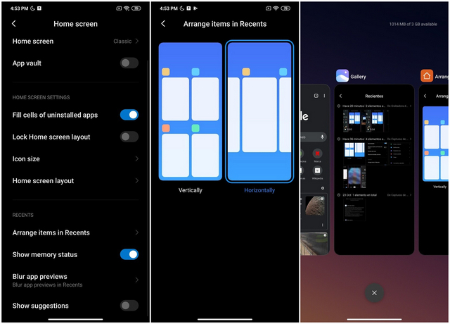
As can be seen from the screenshots below, the new UI will only be offered as an option, which means users will be able to choose whether they want to use the new design or the older, 2×2 vertical scrolling option that they’ve gotten used to over the years. Meanwhile, some of the other changes in the latest version of the MIUI Launcher include a small adjustment to the Gaussian blur scheme, modified animation in and out of the recent task, and some minor bug fixes. Screenshots Courtesy: Telegram user @Deiki From the looks of it, the horizontal scrolling option will apparently be fairly similar to the UX on the Pixel devices and other custom Android ROMs, like OxygenOS, thereby offering a more familiar interface for users transitioning from a different handset. That said, the 2×2 vertical scrolling option still offers much more information, so it’s likely that traditional Xiaomi users who’ve gotten used to that UX will not change their preference any time soon. Either way, in case you’re looking to try out the latest version of the MIUI Launcher, you can do so by downloading the APK from APK Mirror. Do note that you will need to run MIUI 12 for the APK to install properly, although the new Recent Apps UI may still not be available on all devices. That said, it should soon be a part of the MIUI 12 Stable update on all compatible smartphones. Featured Image Courtesy: Telegram user @Deiki
