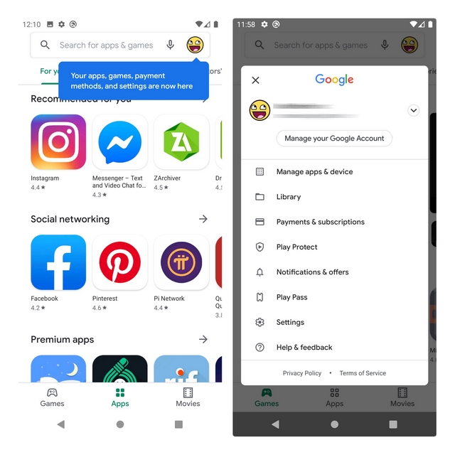
Through this limited redesign test (via Android Police), Google is now adding all the essential settings under the profile icon present at the top-right corner. Take a quick peek at the changed UI in the image below: Image: Android Police As you might be aware, the hamburger menu on the Play Store provides access to a plethora of settings including the My apps & games section, which people frequently visit to update the apps on their phone. Hence, it won’t be an overstatement if I say that this repositioning significantly affects the flow when users open the Play Store. The shift away from the hamburger menu is primarily because they often interfere with Android’s gesture navigation. Does the new implementation avoid messing up with gesture controls? Yes. Does it improve usability or reachability? Partially yes, if you’re a right-hand user and hated the gesture-based way of accessing this section. The gesture trick to access the contents hidden by the hamburger menu with precision is to press and hold the left edge for a couple of seconds, followed by swiping to the right. This also takes some time to get used to and can be finicky at times. If you’re someone like me who is accustomed to this method, the transition to the new way of accessing all these controls will take a few days for getting used to. In fact, this is not the first Google app to remove the hamburger menu. Google has been moving away from the hamburger menu on its apps such as Google Maps and Google Photos. Right now, Google is not rolling out these changes widely. However, don’t be surprised if you get this visual change on the Play Store app on your phone over the coming weeks. Let us know if it is live for you in the comments.
